Hey there,
Is there a way to surround all the bars in a Gantt-Chart with borders?
I have several activities that are colored the same as they belong to the same Resource, and if they appear together in the chart it is difficult to find the beginning and end times.
I tried updating the traces as seen in examples for regular bar charts, but without any success.
For example:
 fig.update_traces(marker=dict(
        color='rgba(58, 71, 80, 0.6)',
        line=dict(color='rgba(58, 71, 80, 1.0)', width=3)
    ))
Thank you!
Hi @thedomay, welcome to the forum! Here is a working example adapted from the documentation page on Gantt charts
import plotly.figure_factory as ff

df = [dict(Task="Job A", Start='2009-01-01', Finish='2009-02-28'),
      dict(Task="Job B", Start='2009-03-05', Finish='2009-04-15'),
      dict(Task="Job C", Start='2009-02-20', Finish='2009-05-30')]

fig = ff.create_gantt(df)
fig.update_traces(mode='lines', line_color='black', selector=dict(fill='toself'))
for trace in fig.data:
    trace.x += (trace.x[0],)
    trace.y += (trace.y[0],)
fig.show()
A few explanations:
- the figure factory
create_gantt creates the Gantt rectangles as Scatter traces which are filled, plus adds other other traces just for the hover (I discovered this from a print(fig), which is always a useful thing to do when you want to modify a figure). In the code you shared, adding line= did not help because the mode of the traces was set to None, hence the line properties were not used.
- therefore you can modify each trace with
update_traces by setting the mode to lines and the line_color, but you need to exclude the transparent traces otherwise they also have lines (you can try it yourself). For this I used the selector argument of update_traces.
- if you want the lines to be closed, you also need to add the first point of each scatter trace at the end; this is what the for loop does.
Hope this helps!
3 Likes
Hey @Emmanuelle,
Thanks for the detailed explanation!
It works like a charm and the print(fig) is very helpful knowledge.
.
1 Like
This looks like a great solution but unfortunately I am having trouble to get it to work with a grouped task chart. I cannot make sense of the data fig data has saved for each trace. Can you explain how to use it in this case:
for var in X:
    if X[var].varValue==1:
        start_time=start_times[var[0],var[1],var[2]].varValue # convert seconds to hours, minutes and seconds
        end_time=completion_times[var[0],var[1],var[2]].varValue
        j_record[(var[0],var[1],var[2])]=[start_time,end_time]
        index_record.append([var[0],var[1],var[2]])
index_record.sort(key=itemgetter(2))


df=[]
for i in index_record:
    df.append(dict(Task='Machine %s'%(i[2]), Start=str(j_record[(i[0],i[1],i[2])][0]), Finish=str(j_record[(i[0],i[1],i[2])][1]),Resource='Job %s'%(i[0])))

fig = ff.create_gantt(df, index_col='Resource', show_colorbar=True, group_tasks=True, showgrid_x=True, title='Flexible_Job shop Schedule')
fig.update_traces(mode='lines', line_color='black', selector=dict(fill='toself'))
fig.update_xaxes(type='linear')
for trace in fig.data:
    print(trace)
fig
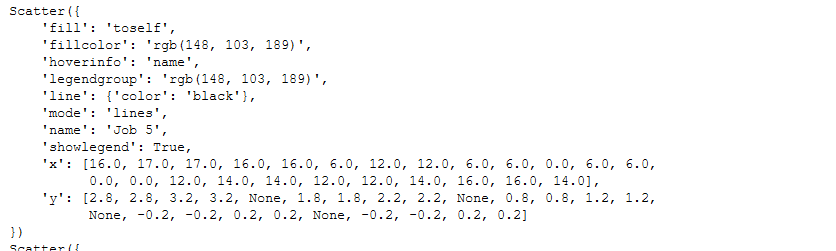
which gives me data like for example:
It results in a gantt with borders but I cannot get the border at the beginning of a block to work
Just doing
fig.update_traces(marker_line_color=‘rgb(0,48,107)’, marker_line_width=1, opacity=1)
gave me borders all around the bars for a px.timeline()
1 Like