Hi,
Is something equivalent to following below, possible with plot.ly javascript library?
Did not come across examples that marry the two layouts – grouped as well as stacked.
http://www.highcharts.com/demo/column-stacked-and-grouped/
Thanks
Shal
Hi,
Is something equivalent to following below, possible with plot.ly javascript library?
Did not come across examples that marry the two layouts – grouped as well as stacked.
http://www.highcharts.com/demo/column-stacked-and-grouped/
Thanks
Shal
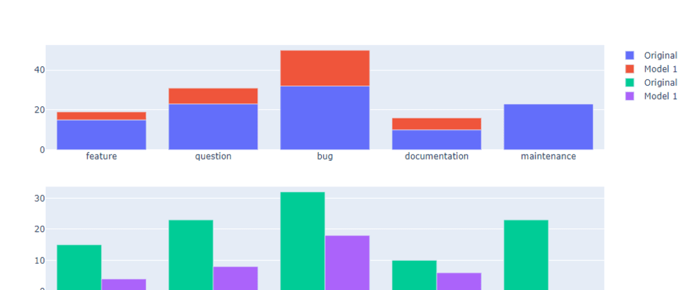
Hi there,
Unfortunately a combination of stacked and grouped bar charts in a single chart is not possible at this time.
You can play around with the offset, width and base properties of each trace when using a stacked layout.
With base = 0 the trace is excluded from the stacking.
In Python:
notStacked = go.Bar(
base = 0,
width = 0.4,
offset = 0.0,
marker = dict(color = “rgb(0,120,255)”)
)
stacked1 = go.Bar(
width = 0.4,
offset = -0.4,
marker = dict(color = “rgb(250,60,0)”)
)
stacked2 = go.Bar(
width = 0.4,
offset = -0.4,
marker = dict(color = “rgb(250,130,0)”)
)
Hi, what about now ? is stacked and grouped bar charts are available or we still have to use @nlichtenberg trick ?
Is there somewhere we can check to see if this feature is implemented?
It is possible to create stacked+grouped charts using subplots, see https://github.com/plotly/plotly.js/issues/1835 for an example
Imagine I need to create a structure like “series xy” where the maximum of x is >100 and the maximum of y is 2. Now I have to create >100 x axes and position them accordingly? I don’t think this is feasible…
Also if you want “series x1” and “series x2” to share the same overall tick, you need to give each axis a title, instead of just use the x data from the trace; thus completely eliminating sharing the same overall tick due to x data from traces. (You’re using subplots that don’t overlay, after all.)
This workaround doesn’t work for my use-case at all, where it’s not about showing actually stacked data but rather visualizing an interval with the help of bars.
I had a plot that first utilized transparent stacked bars to achieve an offset to the origin axis as well as having overlaying bars with different widths to visualize intervals. Then I needed to group them instead of using different widths and ended up providing the origin offset using the base-attribute, while utilizing extra axes for the overlaying bars and transparent traces to keep the grouping consistent for the overlaying bars.
I ended up exactly with what I needed.
It’s possible to change the positions of Apples, Pears and Cherries like 90º degrees 45º degrees? I see I can change the size with xaxis: {title:{font:{size:""}}}, but if I tried some longer names like AwesomeApplesBigTree and put like 10 xaxis. The title doesnt stay in the midle?Theres a way to change these properties? Because the title doesnt chanche with the responsive property.
For Googlers arriving here, I also found this post helpful:
Hey @nlichtenberg , this looks great! How can I achieve the same in JavaScript? I can´t find a way to differenciate between traces in js layout…

