Create traces dynamically for scatter plot

Hi,

I’m trying to create a scatter plot with the circles colored by categories.

My understanding is that I will have to create a trace = go.Scatter(… for each category, the problems is that the number of categories depend on the data.

How can I create traces dynamically and pass them to the data in the graph?

I’m doing this in Dash but it’s more a Plotly/Python question I guess.

Thanks!

I found a way, in case anyone is trying to do the same.

data = []
for name, group in byStockType:
    trace = {
        "type": 'scatter',
        "x": group['Current_Balance'],
        "y": group['Average_Cost'],
        "name": name,
     }
}

Where byStocktype is my df grouped by the variable that has the categories and Current_Balance and Average_Cost the vars with the values I want to show.

Hi I am now to the whole thing maybe you could elaborate a bit on how to implement this in my case.

I have a pivot table that structures my data so that my Graph can be a Bar chart with the Years as X Axis and the Values as Y Axis. It is a stacked bar chart where the different traces are the Market Segments. I have a dropdown that switches between different metrics, but some Metrics don’t include all segments and then the graph doesnt load. So the solution would be dynamic traces but I cant get it to work.

pv = pd.pivot_table(
df_plot,
index=[‘Year’],
columns=[“Market segment”],
values=[‘Value’],
aggfunc=sum,
fill_value=0)

trace1 = go.Bar(x=pv.index, y=pv[("Value", "Market segment A")], name="Market segment A")
trace2 = go.Bar(x=pv.index, y=pv[("Value", "Market segment B")], name="Market segment B")

Hi @isic5,

If you’re still stuck on this, could you please include a complete reproducible example of what you’ve tried so far? Also, could you place your Python code inside a code block so that the formatting doesn’t get messed up? For example

```python
import plotly.graph_objs as go
```

The goal is for people to be able to copy your code directly out of the message, paste it into a jupyter notebook cell, run it, and see what you’re seeing.

Thanks!

For those interested, here is a simple dash example:

import dash
from dash.dependencies import Input, Output
import dash_core_components as dcc
import dash_html_components as html
import pandas as pd

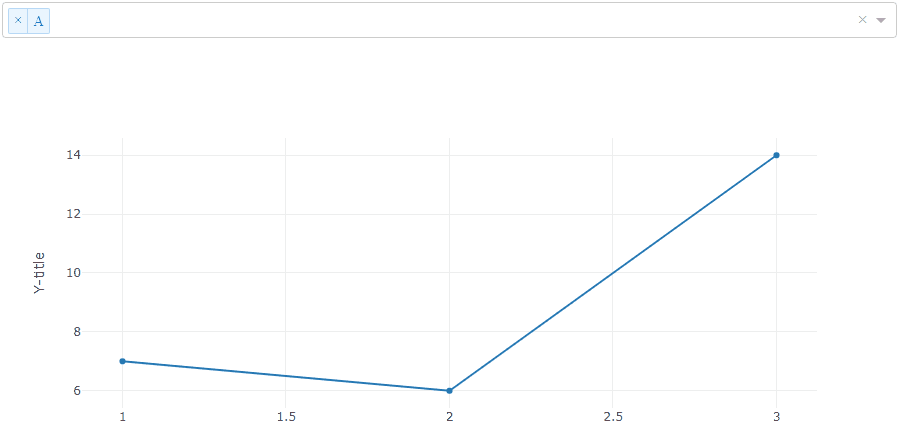
df = pd.DataFrame([['A', 1, 7], ['A', 2, 6], ['A', 3, 14], ['B', 1, 3], ['B', 2, 9], ['B', 3, 2], ['C', 1, 1], ['C', 2, 5], ['C', 3, 11]], columns = ['ID', 'x_val', 'y_val']) 
       
app = dash.Dash('Plotly dynamic traces')

app.layout = html.Div([
    dcc.Dropdown(
        id='my-dropdown',
        options=[
            {'label': i, 'value': i} for i in df.ID.unique()
            ], multi=True, placeholder='Select id...',
        value=[df.ID.min()]
    ),
    dcc.Graph(id='my-graph')
], style={'width': '500'})

@app.callback(Output('my-graph', 'figure'), [Input('my-dropdown', 'value')])
def update_graph(selected_dropdown_value):
              grouped_df = df[df['ID'].isin(selected_dropdown_value)].groupby(by=['ID'])
              layout = dict(
                  xaxis = dict(title="X-title"), yaxis=dict(title="Y-title")
                  )
              data = []
              for ID, group in grouped_df:
                    trace = {
                        "type": 'scatter',
                        "x": group['x_val'],
                        "y": group['y_val'],
                        "name": ID,
                     }
                    data.append(trace)
              return {"data": data, "layout": layout}

if __name__ == '__main__':
    app.run_server()