New to Plotly here but finding it awesome, there are some limitations I am facing though.
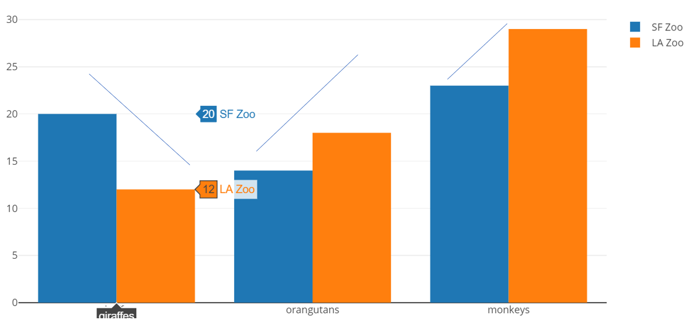
Does anybody have any idea how I can plot a line chart over a grouped bar chart? For example, the grouped bar chart here:https://plot.ly/python/bar-charts/, shows 3 different groups by['giraffes', 'orangutans', 'monkeys'] with 2 categories, name='SF Zoo' andname='LA Zoo'.
Is there a way I can plot a line graph that follows the groups AND the categories. Current when I plot the line chart it does not correspond to the category but I am able to follow the x-axis groupings.
Welcome and glad you’re enjoying the library Do you any reference images (from any plotting library) that show the kind of plot you’re interested in? I’m not sure it’s directly possible, but we might be able to come up with a workaround.
I am aware that the x-axis is relative according to the names, like ['giraffes', 'orangutans', 'monkeys'], but I am not sure how to add a trace which is relative to group as well as categories which are SF Zoo and LA Zoo.
Here’s a work around that will hopefully get you started. The basic idea is to create a second xaxis (xaxis2) right on top of the categorical xaxis that you already have. The line traces can then be positioned on this second xaxis.
import plotly.graph_objs as go
from plotly.offline import iplot, init_notebook_mode
init_notebook_mode()

trace1 = go.Bar(
    x=['giraffes', 'orangutans', 'monkeys'],
    y=[20, 14, 23],
    name='SF Zoo'
)
trace2 = go.Bar(
    x=['giraffes', 'orangutans', 'monkeys'],
    y=[12, 18, 29],
    name='LA Zoo'
)

data = [trace1, trace2]

bargap = 0.2
layout = go.Layout(
    barmode='group',
    bargap=bargap
)

# Create initial figure with grouped bar traces
fig = go.Figure(data=data, layout=layout)

# Add secondary x-axis that overlays categorical xaxis
fig.layout.xaxis2 = go.layout.XAxis(
    overlaying='x', range=[0, len(trace1.x)], showticklabels=False)

# Add a line traces, and associate with the second xaxis
for i in range(3):
    x = [i + bargap/2 + (1-bargap)/4, i + 1 - bargap/2 - (1-bargap)/4]
    y = [25 + 3*i, 22 + 4*i]
    scatt = fig.add_scatter(x=x, y=y, mode='lines', xaxis='x2',
                            showlegend=False, line={'color': 'gray'})

# plot in the jupyter notebook
iplot(fig)
 Do you any reference images (from any plotting library) that show the kind of plot you’re interested in? I’m not sure it’s directly possible, but we might be able to come up with a workaround.