How to use the GeoPandas (or exported GeoJson) file within the Multiple Counties Choropleth

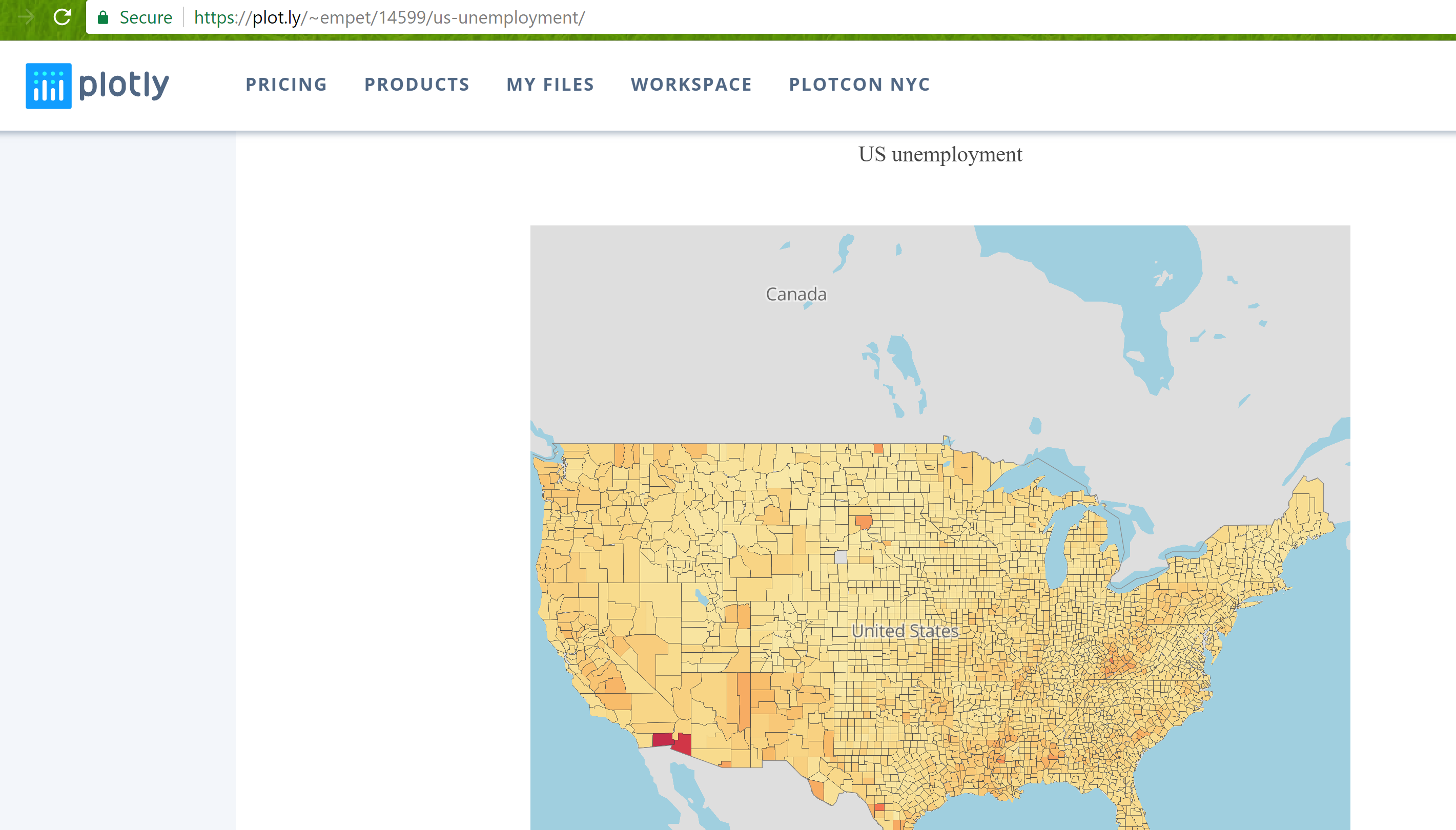
How can I amend your mapbox dict script to work with my geopandas dataframe (or exported GeoJson File) ?
I’m using your https://plot.ly/python/county-level-choropleth/ example.

Be great if I could simply make lists out of the columns in the geopandas dataframe…
colors = list(gpd.colors)

Can you help me amend the below script…or nudge me in the right direction?

Here are the first couple of lines of my GeoJson which I exported from GeoPandas

{
"type": "FeatureCollection",
"crs": { "type": "name", "properties": { "name": "urn:ogc:def:crs:EPSG::4269" } },
"features": [
{ "type": "Feature", "properties": { "STATEFP": "04", "COUNTYFP": "015", "COUNTYNS": "00025445", "AFFGEOID": "0500000US04015", "GEOID": "04015", "NAME": "Mohave", "LSAD": "06", "ALAND": 2147483647, "AWATER": 387344307, "FIPS_COMBINED": "04015", "CountyPop_2016": 205249.0, "Pop_norm": 0.02023717705973874, "Color": "#fffad7",  }, "geometry": { "type": "Polygon", "coordinates":.......

How could I feed geopandas columns into your example script below?

         mapbox=dict(
                layers=[
                    dict(
                        sourcetype = 'geojson',
                        source = 'I actually did export a geojson file from geopandas if needed',
                        type = 'fill',
                        color = 'rgba(163,22,19,0.8)' #be great to make a list of the Geopandas Column ->  list(gpd.color)
        ],
        accesstoken=mapbox_access_token,
        bearing=0,
        center=dict(
            lat=27.8,
            lon=-83
        ),
        pitch=0,
        zoom=5.2,
        style='light'
    ),
)

fig = dict(data=data, layout=layout)
py.iplot(fig, filename='county-level-choropleths-python')
1 Like

@grahama1970
From your geopandas dataframe, define a dict, geoj, that has the structure of a geojson file https://en.wikipedia.org/wiki/GeoJSON.
Then the list of source(s) for mapbox layers:

 sources=[{"type": "FeatureCollection", 'features': [feat]} for feat in geoj['features']]

The layers:

layers=[dict(sourcetype = 'geojson',
             source =sources[k],
             below="water",
             type = 'fill',
             color = facecolor[k],#the list of colors for each shape/layer in choropleth
             opacity=0.8
            ) for k in range(len(sources))]
1 Like

First. Thank you :slight_smile:

Good news:
From your example, it now outputs a chart

Bad News:
The Plotly site shows a blank screen and my macbook (and Google Cloud Compute Instance) was brought to it’s knees.

Question:
Is there something (in my code) that’s screwing up performance?
Or, is this kind of chart better left to a static image generated from Geopandas/Matplotlib, or perhaps Folium which ‘seems’ to be behaving with a similar choropleth?
I had no issues making scatterplot and state choropleths in plotly. Are counties a bridge too far for Javascript?

from the below code:
sources[1]['features'][0]['properties']['Color'] # prints #fffddb

Here is the ‘blank’ screen in Plotly for the chart: https://plot.ly/~grahama1970/2

import plotly.plotly as py
import plotly.graph_objs as graph_objs

mapbox_access_token = mapbox_access_token

# Load and Convert GeoJSON file
geoj2 = json.loads(usapop_gpd.to_json())
sources=[{"type": "FeatureCollection", 'features': [feat]} for feat in geoj2['features']]

colorscl = [[i * .01, v] for i,v in enumerate(colors)]

data = graph_objs.Data([
    graph_objs.Scattermapbox(
        lat=['45.5017'],
        lon=['-73.5673'],
        mode='markers',
        marker=Marker(
            size=14
        ),
        text=['Montreal']
    )
])

layout = graph_objs.Layout(
    height=800,
    autosize=True,
    hovermode='closest',
    mapbox=dict(
    layers=[
        dict(sourcetype = 'geojson',
                 source =sources[k],
                 below="water",
                 type = 'fill',
                 #color = sources[k],#the list of colors for each shape/layer in choropleth
                 color = sources[k]['features'][0]['properties']['Color'],
                 opacity=0.5,
                ) for k in range(len(sources))
       ],
        accesstoken=mapbox_access_token,
        bearing=0,
        center=dict(
            lat=39.8283,
            lon=-98.5795
        ),
        pitch=0,
        zoom=8,
        style='light'
    ),
)

fig = dict(data=data, layout=layout)
py.iplot(fig, filename='county-level-choropleths-python')

county_plot

1 Like

@grahama1970 Accessing your saved code at https://plot.ly/~grahama1970/2#code, via
fig = py.get_figure("https://plot.ly/~grahama1970/2") I saw that the list fig['layout']['mapbox']['layers'] has the length 3064, and each Polygon is described by a large number of points.
For each layer and features are listed a lot of properties. For example,
print fig['layout']['mapbox']['layers'][0]['source']['features'][0]['properties'] displays 13 pairs key-value:

 {u'AFFGEOID': u'0500000US04015',
  u'ALAND': 34475567011L,
  u'AWATER': 387344307,
  u'COUNTYFP': u'015',
  u'COUNTYNS': u'00025445',
  u'Color': u'#fffad7',
  u'CountyPop_2016': 205249.0,
  u'FIPS_COMBINED': u'04015',
   u'GEOID': u'04015',
   u'LSAD': u'06',
   u'NAME': u'Mohave',
   u'Pop_norm': 0.02023717705973874,
   u'STATEFP': u'04'}

To get rid of non-used information I suggest that when you define sources to keep in each source
only the the property ‘Color’, if no other property is used in your code, because otherwise more than 3064 x 13=39832 unnecessary rows are uploaded to Plotly cloud and maybe they stop the browser displaying the chart. Even if you keep only the Color the json file uploaded to the cloud is still big, because there are many Polygons.

2 Likes

As you recommended, I reduced the number of columns to geometry, color, and county population. The map renders but is extremely CPU intensive…Do you recommend a more CPU friendly usa counties shape file with less points? I’m sure other plotly users would have need of usa county level choropleths :slight_smile: The chart chokes on Plotly (https://plot.ly/~grahama1970/2/) and on my Jupyter notebook. My 16 gig macbook pro fan is cranking as we speak. If usa county level choropleths are unrealistic for Plotly, let me know. I’ll seek other alternatives.

import plotly.plotly as py
import plotly.graph_objs as graph_objs

mapbox_access_token = mapbox_access_token

usapop_gpd_small = usapop_gpd[['FIPS_COMBINED','geometry','Color' ]]

# Load and Convert GeoJSON file
geoj2 = json.loads(usapop_gpd_small.to_json())
sources=[{"type": "FeatureCollection", 'features': [feat]} for feat in geoj2['features']]

colorscl = [[i * .01, v] for i,v in enumerate(colors)]

# In Next Rev will be about 15000 Points
data = graph_objs.Data([
    graph_objs.Scattermapbox(
        lat=['45.5017'],
        lon=['-73.5673'],
        mode='markers',
        marker=Marker(
            size=14
        ),
        text=['Montreal']
    )
])

layout = graph_objs.Layout(
    height=800,
    autosize=True,
    hovermode='closest',
    mapbox=dict(
    layers=[
        dict(sourcetype = 'geojson',
                 source =sources[k],
                 below="water",
                 type = 'fill',
                 #color = sources[k],#the list of colors for each shape/layer in choropleth
                 color = sources[k]['features'][0]['properties']['Color'],
                 opacity=0.5,
                ) for k in range(len(sources))
       ],
        accesstoken= MAPBOX_API_KEY,
        bearing=0,
        center=dict(
            lat=39.8283,
            lon=-98.5795
        ),
        pitch=0,
        zoom=3,
        style='light'
    ),
)

# py.image.save_as(fig, filename='./map_image_exports/county_test.png')
# from IPython.display import Image
# Image('./map_image_exports/county_test.png')

fig = dict(data=data, layout=layout)
py.iplot(fig, filename='county-level-choropleths-python')
1 Like

On github/web there exist 3 types of topojson files for us-counties:

Try to plot the choroplets with all three and decide which one has an acceptable resolution, and a lower CPU usage.
A topojson file can be converted into a geojson one, as I illustrated here: https://plot.ly/~empet/14397.

1 Like

Am I supposed to change the sourcetype to topjson or leave as geojson?
I’m using the 20M from your github link.

I imported the file into geopandas with:
cdf20 = gpd.read_file('./data/geo/20m-US-counties.json', encoding='UTF-8')

Using sourcetype = ‘geojson’, I’m getting a fairly lengthy error below.

JSONDecodeError: Expecting value: line 2 column 1 (char 1)

During handling of the above exception, another exception occurred:

PlotlyRequestError                        Traceback (most recent call last)
<ipython-input-168-491db0455f92> in <module>()
     46 
     47 fig = dict(data=data, layout=layout)
---> 48 py.iplot(fig, filename='county-level-choropleths-python')

~/anaconda3/envs/OSMNX/lib/python3.6/site-packages/plotly/plotly/plotly.py in iplot(figure_or_data, **plot_options)
    133     if 'auto_open' not in plot_options:
    134         plot_options['auto_open'] = False
--> 135     url = plot(figure_or_data, **plot_options)
    136 
    137     if isinstance(figure_or_data, dict):

~/anaconda3/envs/OSMNX/lib/python3.6/site-packages/plotly/plotly/plotly.py in plot(figure_or_data, validate, **plot_options)
    226     data = fig.get('data', [])
    227     plot_options['layout'] = fig.get('layout', {})
--> 228     response = v1.clientresp(data, **plot_options)
    229 
    230     # Check if the url needs a secret key

~/anaconda3/envs/OSMNX/lib/python3.6/site-packages/plotly/api/v1/clientresp.py in clientresp(data, **kwargs)
     33 
     34     url = '{plotly_domain}/clientresp'.format(**cfg)
---> 35     response = request('post', url, data=payload)
     36 
     37     # Old functionality, just keeping it around.

~/anaconda3/envs/OSMNX/lib/python3.6/site-packages/plotly/api/v1/utils.py in request(method, url, **kwargs)
     84         content = response.content if response else 'No content'
     85         raise exceptions.PlotlyRequestError(message, status_code, content)
---> 86     validate_response(response)
     87     return response

~/anaconda3/envs/OSMNX/lib/python3.6/site-packages/plotly/api/v1/utils.py in validate_response(response)
     23     except ValueError:
     24         message = content if content else 'No Content'
---> 25         raise exceptions.PlotlyRequestError(message, status_code, content)
     26 
     27     message = ''

PlotlyRequestError: 
<html><head>
<meta http-equiv="content-type" content="text/html;charset=utf-8">
<title>502 Server Error</title>
</head>
<body text=#000000 bgcolor=#ffffff>
<h1>Error: Server Error</h1>
<h2>The server encountered a temporary error and could not complete your request.<p>Please try again in 30 seconds.</h2>
<h2></h2>
</body></html>

The first item of sources looks like…
sources=[{“type”: “FeatureCollection”, ‘features’: [feat]} for feat in geoj2[‘features’]]
sources[0]
prints…

    {'features': [{'geometry': {'coordinates': [[[-101.06703496318472,
                   37.38749093265444],
                  [-100.65203125388423, 37.38749093265444],
                  [-100.63437152157357, 37.381264522009644],
                  [-100.63260554834251, 37.000208190548314],
                  [-100.85511817545681, 36.99896290841936],
                  [-100.94518281024118, 36.997717626290395],
                  [-101.06703496318472, 36.997717626290395],
                  [-101.06703496318472, 37.38749093265444]]],
                'type': 'Polygon'},
               'id': '0',
               'properties': {'Color': '#ffffe0', 'FIPS_COMBINED': '20175'},
               'type': 'Feature'}],
             'type': 'FeatureCollection'}
1 Like

sourcetype must be geojson. You have to convert topojson to geojson as I said before. I didn’ t work with topojson to geopandas dataframe. So I cannot figure out what is wrong with your last code.

1 Like

Great.
Good news:
I converted the file from TopoJson to GeoJson, and the choropleth renders :slight_smile:
Thanks to http://jeffpaine.github.io/geojson-topojson/

Bad News:
The 20m (low def) and 5m (hi def) versions bring my macbook pro (late 2015/16 gigs) to it’s knees. And, countly level population stuff is a just a base for adding a scatter plot of about 5000 points.
Basically, the plot unusable for presentation purposes.

Is there some additional optimization for county level choropleths?

Or is this a limitation of Plotly SVG Rendering? If it’s a limitation, then I’ll move on to Folium or just do the thing straight from Geopandas. The Plotly stuff looks nice. I’d hate to move on.

1 Like

Did you try the topojson with 10m? It’s just between the two ones.

1 Like

I did try the 10m from your link
Plotly tries to render the chart (within jupyter)…the plotly rendering gif starts cycling…
Then, I get the Chrome error, ‘Rats, WebGL has hit a snag’, and then the rendering gif disappears into a white box

I feel a bit like a beta tester. Are there any working example of usa county level choropleth in Plotly? Or, is this kind of thing (simply) not recommended with Plotly tech? I’m ok with it. If you have another idea, I’m happy to try it :slight_smile:

Seems like most map/pandas/datascience folks would want a usa county level choropleth. You can’t get very granular with state-level. I’m also happy to give you the jupyter notebook it helps. Let me know if it’s not feasible/realistic within Plotly.

1 Like

I’ve just generated this choropleth https://plot.ly/~empet/14599 from the file us-10m.v1.json. My Chrome didn’t crash, but the shapes are rendered successively, and very slow, from the top to the bottom of the map.
This is a snippet of my choropleth, just in case you cannot open my plot us-counties

1 Like

About 3 seconds in, I got another webgl crash

Are you having the same issues?
If so, should I (not) be using Plotly for this kind of choropleth? I’m open to suggestions :slight_smile:

  • I have 4 gigs free
  • mac os 10.12.6 (16G29)
  • MacBook Pro (Retina, 15-inch, Mid 2015
  • 2.8 GHz Intel Core i7
  • 16 GB 1600 MHz DDR3
1 Like

No, my Chrome doesn’t crash:

1 Like

Great. There’s hope. Can you share you’re notebook python script? Perhaps, there is something I’m doing wrong in the code?
This rough took about 5 minutes to render within Plotly. The Zoom and Rendering are too slow to use.

If you have any other suggestions, let me know. Otherwise it’s off to Folium or (last resort) an image from Geopandas

Either way, Thanks for your help. Wish I could present with it. This type of interactive plot could be very powerful.

1 Like

There is no special in my code. The choropleth is rendered very slow as I said before:

At the moment I have no suggestion for improvement :frowning:

2 Likes

Maybe Plotly will give add a feature to rasterize the shape file rather than rendering all those individual county vectors?
Until SVG(?) becomes more efficient, be a great interim solution

1 Like

One last question on this subject, within this type of choropleth, where does the color bar code go?
Thanks for all of your help.
I’ve decided to output these charts as images to make my deadline :slight_smile:

# Add the Color Bar---But Where?
colorscl = [[i * .01, v] for i,v in enumerate(colors)]
cmax=100,
cmin=0,
colorscale = colorscl,
showscale = True,
autocolorscale=False,
color=range(0,101),
colorbar= graph_objs.ColorBar(len = .89)),

Plotly Code (Same as before):

    data =  graph_objs.Data([
        Scattermapbox(
            lat=list(plotly_df.Latitude),
            lon=list(plotly_df.Longitude),
            mode='markers',
            marker=Marker(
                size=4,
                #color=colors,
                opacity=0.7),
            text=list(plotly_df.Text),
            hoverinfo='text',
            showlegend=False),
        
        Scattermapbox(
            lat=list(bestclient_df.Latitude),
            lon=list(bestclient_df.Longitude),
            mode='markers',
            marker=Marker(size=12, color='rgb(50, 255, 100)', opacity=0.8),
            text=list(bestclient_df.Text),
            hoverinfo='text',
            showlegend=False,
        )
    ])

    layout =  graph_objs.Layout(
        title= '{0} ({1}-{2})'.format(
            mytitle, client_count, start_year, end_year),
        autosize=True,
        hovermode='closest',
        mapbox=dict(
        layers=[
            dict(sourcetype = 'geojson',
                     source =sources[k],
                     below="water",
                     type = 'fill',
                     #color = sources[k],#the list of colors for each shape/layer in choropleth
                     color = sources[k]['features'][0]['properties']['Color'],
                     opacity=0.5,
                    ) for k in range(len(sources))
           ],
        accesstoken=MAPBOX_API_KEY,
        bearing=0,
        center=dict(lat=38, lon=-94),
        pitch=0,
        zoom=3,
        style='light'
        )
    )

    fig = dict(data=data, layout=layout)
    return py.iplot(fig, filename='Affinity Sales')

1 Like

@grahama1970 Here’s one Python workflow for creating SVG US choropleths and freezing the zoom for performance. In addition to freezing zoom, another important technique is to limit the number of traces to as few as possible - chart load time decreases with the number of traces in the chart.

https://plot.ly/~jackp/18292.embed

Thanks for the example :slight_smile:
I’ll try out your approach on the next round of county-level choropleths. Seems like plotly should give an option to create a static choropleth overlay image over drawing county vectors with Javascript. Would speed up the render dramatically–I think.