Mesh3d plots no legend or colors

Hi, I’m making a 3dmesh type plot through R with the plot_ly function.

When I create other type of plots a legend with different colors appear and the corresponding colors applied in the plot.

But when I try to make a 3dmesh type plot, no legend shows up or lets me change the colors.

Any idea of what the problem can be??

Here is a screenshot of the result.

Thanks

Only certain trace types support legend items at the moment.

‘mesh3d’, ‘heatmap’, ‘contour’, ‘histogram2d’, ‘histogram2dcontour’, ‘choropleth’ and ‘surface’ all do not support legend items.

Hi Etienne,
And what about assigning a color to a mesh3d plot?
The chart reference documentation mentions the color attribute.
However this doesn’t seem to work. It always yields an warning message:

In RColorbrewer::brewer.pal(N, “Set2”):
minimal value for n is 3 returning requested palett with 3 different levels

Also, the hoverinfo doesn’t give the name but the value of color.
Thanks in advance for your answer.

@WHMan I suspect you’re using plot_ly(color = ...), which applies scaling/handling that you probably don’t want for a mesh3d plot. Instead, if you use plot_ly(marker = list(color = ...)), the values will be taken verbatim.

Thanks for your swift response @carson!

Unfortunately, it doesnt work. Here’s an example of my code:

> plot_ly(ell3d[[1]],x=vb[1,],
>         y=vb[2,], 
>         z=vb[3,],
>         showlegend=TRUE,legendgroup="ellipse",
>         contour=list(show=TRUE, color="#000", width=15),
>         type = "mesh3d", alphahull=0, opacity=0.2, marker=list(color = "#000"))

As you can see the mesh is blue (and not black).

PS. sorry for hijacking this topic. If it’s more appropriate to start a new one, I will.

It appears I need to study the figure reference more closely! I’ve made a note of this problem and also provided a workaround here – https://github.com/ropensci/plotly/issues/413

Thanks for your workaround!
Works perfectly now.

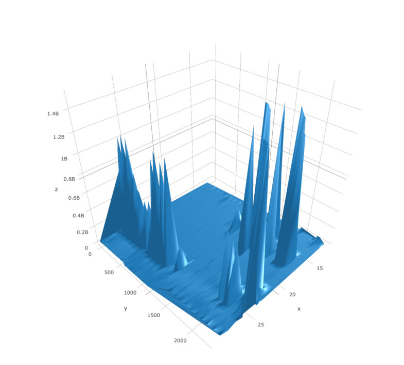
i think the problem is that a colour legend does not work with mesh 3d.

i asked the plotly team and they were unable to give an answer/didnt know how to solve it.

my work around was the plot the same graph as a scatter 3d and put a colour legend in and then i cut and past the legend out for my final figure.

so i did this just to make my scale

plot_ly(
x = points[, 1], y = points[, 2], z = points[, 3],

marker = list(
autocolorscale = FALSE,
cmax = 2.5,
cmin = 0,
color = vert$colour,
#colorscale = vert$bi,
colorbar = “middle”,
colorscale = list(c(0, “#800026”),
list(0.2, “#bd0026”),
list(0.24, “#e31a1c”),
list(0.28, “#fc4e2a”),
list(0.32, “#fd8d3c”),
list(0.36, “#feb24c”),
list(0.4, “#ffffe5”),
list(0.44, “#d9f0a3”),
list(0.48, “#addd8e”),
list(0.52, “#78c679”),
list(0.56, “#41ab5d”),
list(0.6, “#238443”),
list(0.64, “#41b6c4”),
list(0.8, “#225ea8”),
list(1, “#081d58”)),
line = list(width = 0),
opacity = 0.9,
size = 20,
symbol = “circle”,
showscale=TRUE),

opacity = 0.5,
type=“scatter3d”,
mode= “markers”,
#visable=FALSE
)

i then added this scatter3d with an opacity of 0 to the original mesh3d graph

using >%> add trace and this provided a good workaround

ie make a second graph with your scale on it in a plotly format that accepts scales ie scatter3d, and then hide that second plot but not your scale