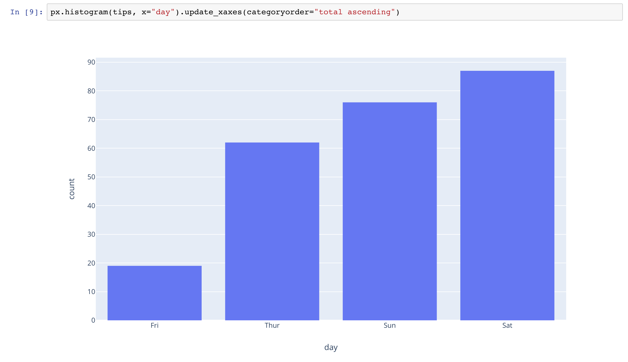
I am using the Plotly Express Histogram plot to display a groupby sum for a dataframe. If I am using cufflinks, I will normally do
df.groupby('group')['col'].sum().sort_values(ascending=False).iplot(kind='bar')
I realize I can do the same thing using
px.histogram(df, x='group', y='col', histfunc='sum')
However, I don’t know how to sort the bar by its values. Does plotly express support this function?
1 Like
The next release of Plotly.py and Plotly Express will support this, yes! I’ll post an example in a day or two
1 Like
@nicolaskruchten , I can’t wait to see the new release of plotly_express. Keep up with the good work.
Also works with multiple traces:
3 Likes
Thanks! This is a really clean API! I pip install plotly_express again this morning (I am in China), and for version 0.3.0, I don’t see this feature yet, so I assume will be in the next release?
No, this should work with 0.3.0 … what’s not working such that you “don’t see this feature” yet? Is it returning some kind of error message?
Installing plotly_express==0.3.0 should cause plotly to upgrade to 3.10.0 which includes this feature.
Sorry, a typo on my part cause the error. I type update_xaxis instead of update_xaxes. Again, sorry for the confusion.
Sorry, my bad for pasting screenshots instead of code
Here’s the code in case others want to paste it later:
px.histogram(tips, x="day", color="smoker").update_xaxes(categoryorder="total descending")
Note that this trick works on all 2d-cartesian categorical axes: you can use it with scatter, bar, line, heatmap, box, violin, etc
2 Likes
This thread was very helpful for me, but I’m curious–after sorting the bars by size, how can we order the sequential colors to reflect that new sort order? Same question goes for the Legend.
For example, I want to see the sequential coloring applied evenly from left to right, but the sort order to also be largest to smallest.
tips = px.data.tips()
px.histogram(tips, x=“day”, color=“day”, height=400, width=800, color_discrete_sequence=px.colors.diverging.Spectral)
px.histogram(tips, x=“day”, color=“day”, height=400, width=800, color_discrete_sequence=px.colors.diverging.Spectral).update_xaxes(categoryorder=“total descending”)
Similarly, for something like this, how could we sort by percent non-smoker?
px.histogram(tips, x=“day”, color=“smoker”, height=400, width=800, barmode=“relative”, barnorm=‘percent’)
These are all really good ideas but unfortunately we don’t have any built-in support for doing these automatically just yet!
1 Like
Thanks for your reply and ongoing contributions!
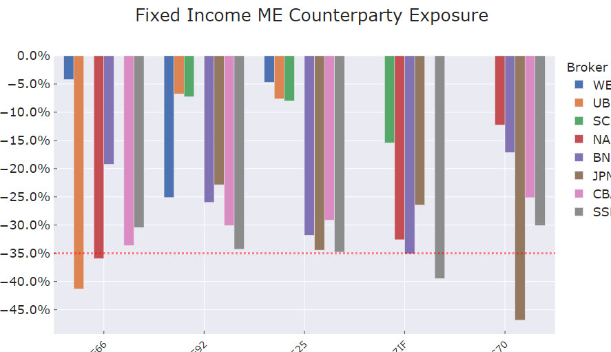
Hello! Great tool, thanks! I am plotting with this code, the x-axis is almost sorted, but not completely. Any idea of might be going on?
And one question: can I change the order of the “color” category as well?
1 Like
Varlor
June 10, 2020, 7:59am
15
@nicolaskruchten Is there any way to do the same (sort of xaxes) with px.box ?
Hi there, thanks for your help.
Does this work on a grouped bar chart, i tried it but it is still not ordered correctly.
“”"
fig.update_xaxes(ticks=‘inside’, tickangle =-45, tickfont = dict(size=14), title_font= dict(size=16), categoryorder = ‘total ascending’) “”"
This is the chart i got
@nickmuchi I think that looks right actually: it sorts by the total of all traces per item, and that first one does look like it adds up to a much more negative number than the next one over and so on, no?
Thanks for the response. Your explanation makes sense, i think i was under the impression that it could arrange in a descending order per group of bars rather than the total.