Hi Expert,
I have a query on Time series forecasting with plotly. I have built a forecasting chart however few things needs to be changed but its not working for me. Please find the attachment for details and kindly let me know the correction or suggestion for R code.
Query:
-
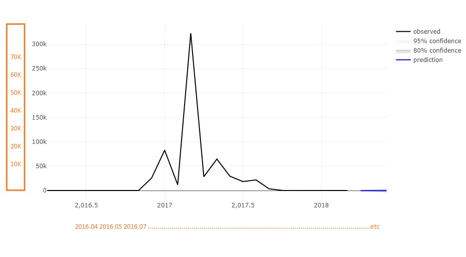
currently X Axis is showing 2,016.5, 2017 , 2017.5 , etc however I want it to show yearmonth like 2016.04,2014,05,etc.
Please be informed yearmonth is a field in data, please refer attached data -
currently Y Axis is showing lables with the difference of 50 K , however I want it to show as 5 K, 10K,15K, etc.
Below is R code used :
library(forecast)
library(plotly)
ord <- order(ds$`Calendar Year-DISPLAY_KEY`,ds$`Calendar Month-DISPLAY_KEY`)
sds <- ds[ord,]
firstRec <- sds[1,]
mn <- as.numeric(firstRec$'Calendar Month-DISPLAY_KEY')
yr <- as.numeric(as.character(firstRec$'Calendar Year-DISPLAY_KEY'))
tm <- ts(data = sds$Calc_Best_DSO , start= c(yr,mn) ,frequency = 12)
plot(tm)
tm[is.na(tm)] <-0

fit <- ets(tm)
fore <- forecast(fit, h = 3, level = c(80, 95))

plot_ly() %>%
  add_lines(x = time(tm), y = tm,hoverinfo = "text",
            color = I("black"), name = "observed",text= paste("Month: ",sds$`Calendar Month-DISPLAY_KEY`,
                    "<br>","Year: ",sds$`Calendar Year-DISPLAY_KEY`,
                   "<br>","DSO: ",sds$Calc_Best_DSO)) %>%
  add_ribbons(x = time(fore$mean), ymin = fore$lower[, 2], ymax = fore$upper[, 2],
              color = I("gray95"), name = "95% confidence") %>%
  add_ribbons(x = time(fore$mean), ymin = fore$lower[, 1], ymax = fore$upper[, 1],
              color = I("gray80"), name = "80% confidence") %>%
  add_lines(x = time(fore$mean), y = fore$mean, color = I("blue"), name = "prediction")
Below is sample data:
Month,Year,YearMonth,Population
1,2017,201701,100
1,2018,201801,300
2,2018,201802,310
3,2018,201803,320
4,2018,201804,330
2,2017,201702,200
3,2017,201703,300
4,2017,201704,400
5,2017,201705,500
6,2017,201706,600
7,2017,201707,700
8,2017,201708,800
9,2017,201709,900
10,2017,201710,1000
11,2017,201711,1100
12,2017,201712,1200